
Overlaying & Intersecting Layers in Geospatial Analysis
The most classic form of Geospatial Analysis is overlaying a point layer (vector) onto a map (vector/raster layer). I hesitate to call this Geospatial Analysis - because honestly, it’s merely geospatial visualisation (not really analysis per se…) - but people use the term “analysis” very loosely, so let’s just go with it.
Let’s start by getting some data. I analyzed the MRT dataset previously - this time, I want to look at bus stops. Online, we can see a GeoJSON (vector) data file of all the bus stops in Singapore represented as a point.
Let’s use the API code to get the data:
import requests

dataset_id = "d_3f172c6feb3f4f92a2f47d93eed2908a"
url = "https://api-open.data.gov.sg/v1/public/api/datasets/" + dataset_id + "/poll-download"

response = requests.get(url)
json_data = response.json()
if json_data['code'] != 0:
    print(json_data['errMsg'])
    exit(1)

url = json_data['data']['url']
response = requests.get(url)
data = response.json()
Next, create a geodataframe with the data:
import geopandas as gpd
import numpy as np
import pandas as pd

gdf = gpd.GeoDataFrame.from_features(
    data["features"],
    crs="EPSG:4326"
)

gdf
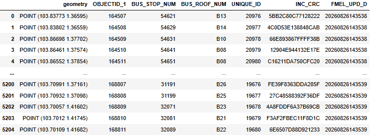
Doing this will give you this output:
With geopandas, it is very easy to get a quick feel of the dataset on a map. Just call the .plot method on the entire geodataframe.
gdf.plot(markersize = 0.5)
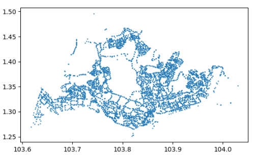
Looks good and correct!
Overlaying Vector Data on Raster Data - Points Superimposed On A Map
We could stop here, but come on. Surely we can do more. To someone who is familiar with the Singapore map, you may be able to make out the shape of the map and identify that it’s Singapore. But for others, is there any way we can make it clearer?
Sure there is! We can superimpose a raster map onto this map - with the raster map being an actual map of Singapore. This would allow us to see where these points actually belong in Singapore.
The base raster map of Singapore can be easily obtained via the Folium package:
import folium

m = folium.Map(location = [1.35, 103.82], zoom_start = 12)

m
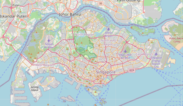
The next step is to overlay the bus stop points layer onto this raster map, which is done via the following code:
#add points

for _, row in gdf.iterrows():
    folium.CircleMarker(
        location=[row["geometry"].y, row["geometry"].x],
        radius=2,
        color="black",
    ).add_to(m)

m
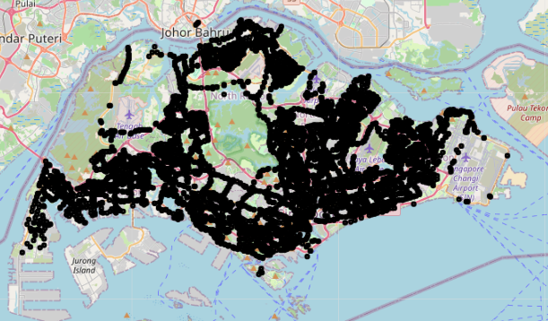
Nice!
From here, we can already gather some information about the distribution of bus stops in Singapore. We can see that overall, the bus stop distribution is quite dense, and most areas actually do have bus stops all overall. That said, there are some areas, like Lim Chu Kang, Central Catchment Area, Tengah, Changi Airport, which seem to have fewer bus stops compared to other areas.
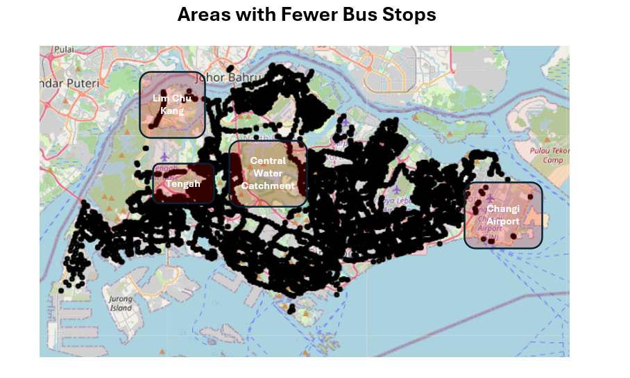
Of course, this is not a robust exercise, and we have not identified the reason why these areas have fewer bus stops than other areas. For the Central Water Catchment, the entire area is a protected nature reserve, so it’s naturally normal to have no bus stops there!
Nevertheless, it’s still interesting to see the geospatial distribution of bus stops throughout Singapore.
Adding Areas (Polygons) For Analysis
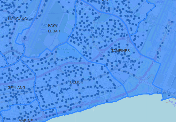
But let’s take it one step further. Say I want to compare the number of bus stops between Tampines and Bedok. How would I go about doing that? Just based on visual intuition, it’s difficult to count the number of bus stops in each region for comparison. Moreover, it’s also unclear which areas exactly belong the Bedok versus Tampines.
One way to address this issue is to have a standardized source of area demarcation. We need a dataset which separates Singapore into regions clearly & reproducibly, and we need not look further as this data can easily be found here
So let’s get this polygon layer (vector) and superimpose it onto the map to see what we get.
import requests

dataset_id = "d_2cc750190544007400b2cfd5d7f53209"
url = "https://api-open.data.gov.sg/v1/public/api/datasets/" + dataset_id + "/poll-download"

response = requests.get(url)
json_data = response.json()
if json_data['code'] != 0:
    print(json_data['errMsg'])
    exit(1)

url = json_data['data']['url']
response = requests.get(url)
data = response.json()

regions_gdf = gpd.GeoDataFrame.from_features(
    data["features"],
    crs = 'EPSG:4326'
)

regions_gdf

folium.GeoJson(
    regions_gdf,
    tooltip=folium.GeoJsonTooltip(
        fields=["PLN_AREA_N"],
        aliases=["Region"]
    )
).add_to(m)

m
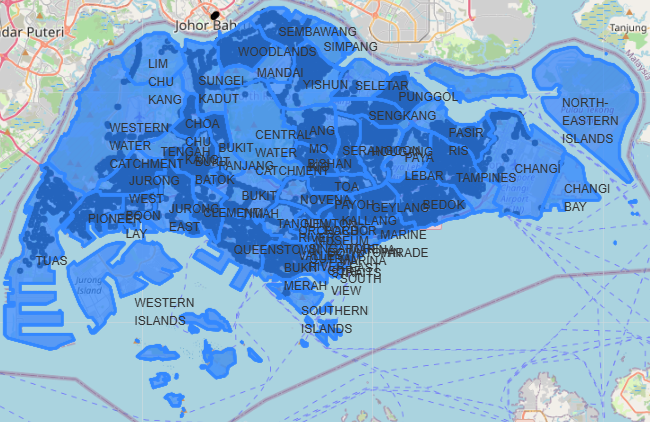
Very nice! We have now separated Singapore into Polygons - with each polygon representing a region. The boundary between Tampines & Bedok is also very clear now, which we can see when we zoom in:
So now, how can we obtain the number of bus stops within each region for comparison?
Intersecting Vector Layers - Spatial Joins
To do this, it is really simple. All we need to do is count the number of points within each polygon, and we will be able to count the number of bus stops within each region of Singapore.
We can do this via a spatial join in Geopandas, with the sjoin() function. The concept is similar to joining dataframes, but this time based on spatial characteristics. You want to find all the points that lie within each polygon - so you join the polygon dataframe to the points dataframe by checking which polygon the point lies “within”.
joined = gpd.sjoin(
    gdf,
    regions_gdf,
    how="left",
    predicate="within"
)

counts = joined.groupby("PLN_AREA_N").size()
counts
Your output is ready!
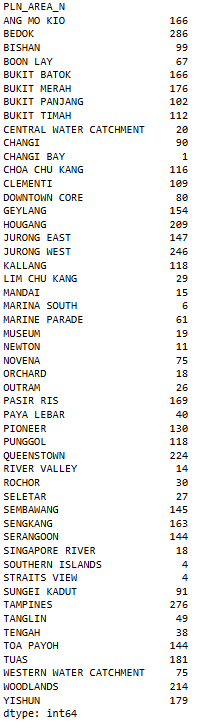
Since we wanted to compare between Tampines & Bedok - let’s look at how many bus stops lie within each region.
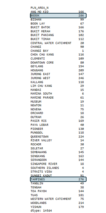
Very close numbers, but Bedok still wins by 10! 🎉
Conclusion: Further Analysis
But wait. Is this analysis fair? Bedok may have more bus stops than Tampines, but is that simply because Bedok has a larger land area than Tampines? To make the comparison fairer, perhaps we may need to divide the number of bus stops by the land area of each polygon - so that we can see the number of bus stops per meter squared. Is that possible? Definitely! And we’ll see how in the next post!
Note: This post is part of a series of posts regarding Geospatial Data Analysis